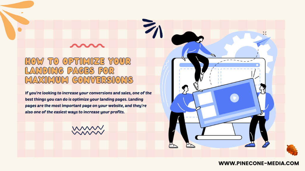
If you’re looking to increase your conversions and sales, one of the best things you can do is optimize your landing pages. Landing pages are the most important page on your website, and they’re also one of the easiest ways to increase your profits. With that said, optimizing a landing page isn’t always easy. There are many factors that go into making sure a landing page converts as well as possible—from how it’s designed to what features it offers—and each factor plays an integral role in how successful your conversion rate will be.

How to Optimize Your Landing Pages for Maximum Conversions
Landing pages are a crucial part of your marketing strategy. Landing pages are a great way to convert visitors into leads, and leads into customers. They’re also a powerful tool for driving sales and increasing revenue. A good landing page will:
- Have an eye-catching headline that grabs the reader’s attention
- Include an image that reinforces the headline
- Tell visitors exactly what they’ll get if they sign up or make a purchase
Use a Strong Call-To-Action
The call-to-action (CTA) is an essential part of any landing page. It’s what your visitor sees and clicks on, so it has to be clear, concise and compelling enough to get them to take action.
Make sure that your CTA stands out from the rest of the page–you want it to be obvious what they should do next! Use a button or link that draws attention and makes sense within context of your site design; if possible try using color psychology principles such as contrast or proximity between elements in order attract more attention towards these items on screen at once which will increase conversions rates for this step in particular because visitors will feel more compelled towards clicking on those areas when there’s something nice looking like this next to them instead than just plain black text over here somewhere else.
Personalize your landing pages to maximize conversions.
- Personalize based on device: If a user is visiting from an iPad, for example, show them a different call-to-action (CTA) than you would if they were visiting from a laptop or desktop computer. This can be done by using the device’s operating system and browser information in order to make decisions about what content should be displayed on their screen.
- Personalize based on location: If someone searches for “restaurants” while they’re at home or work, but then clicks through one of those results when they’re at another location–like during lunch break at school or work–it’s likely that their needs will change accordingly as well! Use geolocation data from Google Analytics to determine where your visitors are coming from so that you know when it makes sense to personalize the messaging on each page according to where those visitors live/work/play etc.
Use High-Quality Images and Videos
The quality of your images and videos is crucial for getting the most out of your landing page, so it’s important to make sure that they are high-quality. Images should look crisp and clear, with no graininess or pixelation. Videos should be in full HD resolution (720p or higher), but if you can’t get that level of quality on a video, don’t stress too much about it–the main thing is that the video looks good enough so that people aren’t distracted by poor video quality while they’re trying to watch it!
It’s also important that you use images on your landing page that are relevant to your product or service; this will help reinforce what you’re selling without distracting from the overall message being conveyed by those elements in combination with other elements like text copywriting or call-to-action buttons at the bottom of each page section (more on those later). If possible though try not using too many different kinds because then things might start feeling cluttered which could confuse visitors who aren’t sure where exactly all these different pieces fit together within one cohesive whole.
Create Multiple Landing Pages for Different Audiences, Goals and Devices
Different Audiences: Your audience may have different needs depending on their role in the organization. For example, if you’re targeting executive management at a company and want them to sign up for a webinar on how to improve sales performance through better use of technology tools, then it makes sense that this target audience would be interested in hearing about how they can improve their sales numbers. On the other hand, if you are targeting middle managers who are responsible for managing employees’ time sheets or expense reports (and therefore need access to these systems), then it might make more sense for those middle managers to know about features such as time off requests within an employee portal rather than focusing on improving overall sales numbers across all departments within an organization.* Different Devices: Different devices offer different screen sizes which means that certain elements may appear differently depending on whether someone views them from his computer monitor versus his smartphone.* Multi-Device Testing Tools: There are many multi-device testing tools available today such as Google’s AMP Projector tool which allows developers/marketers test their websites across several devices simultaneously so they can see exactly what each device looks like before publishing anything online.
Test and Iterate On Your Landing Pages’ Design and Copy
Once you’ve got your landing page created, it’s time to start testing different variations of the design and copy. You might be wondering how you can test a landing page without spending thousands on ad campaigns. There are plenty of tools out there that will help you do this cheaply and easily.
There are several best practices that you can use to optimize your landing pages to get more conversions.
- Use a clear and concise call-to-action.
- Ensure that your landing pages are mobile friendly.
- Use high quality images and videos to grab the attention of visitors, but don’t make them too large so they take up too much space on the page and slow down load times (which will hurt conversions).
- Create multiple landing pages for different audiences and goals, such as one that focuses on getting people signed up for an email list, another with more information about what you do or sell, etc., so users can choose which version works best for them based off their needs at that time in their buying journey.
- Test different designs/layouts/copy variations until you find something that works best for each individual audience type before moving forward with A/B testing; there’s no need to settle on something just because it’s been working well so far if there are better options available!
With these tips in mind, you can start optimizing your landing pages for maximum conversions. By creating compelling calls-to-action and using high-quality images and videos, you’ll be able to engage visitors on a deeper level.


