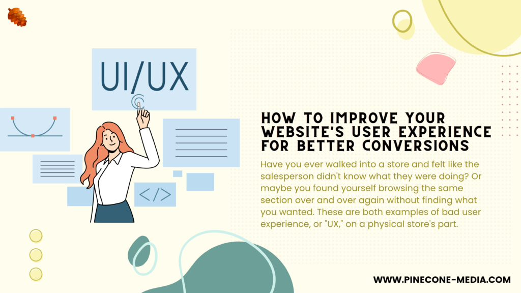
Have you ever walked into a store and felt like the salesperson didn’t know what they were doing? Or maybe you found yourself browsing the same section over and over again without finding what you wanted. These are both examples of bad user experience, or “UX,” on a physical store’s part. User experience is even more important when it comes to your website. When people land on your site, they want an easy way to find what they’re looking for in as little time as possible. If your website isn’t designed with this in mind, then it could be costing you conversions—and dollars!
1. Optimize site navigation
It’s important to make it easy for users to find what they’re looking for on your site. A good way to do this is by using breadcrumbs (the trail of links at the top of a page) or a sitemap, which shows all pages on your site in hierarchical order. You can also add a site map if you have an extensive menu structure with many levels and sub-menus.
2. Make it easy to find your phone number
The second thing you should do is make it easy to find your phone number.
You might think that this is obvious, but it’s not always easy to know where to put a phone number on your website or how many places you should put it. The best way to ensure that visitors can easily find the information they need is through consistent placement throughout all pages of your site.
3. Offer multiple ways to contact you
Offering multiple ways to contact you is a great way to show your customers that they can reach out if they have any questions or concerns. This can be in the form of phone number, email address and live chat.
Phone number: A phone number allows people who prefer speaking with someone over texting or emailing them an opportunity do so. It also gives them another way to contact you if their preferred method isn’t working out for whatever reason (like if they don’t have internet access).
Email address: An email address is helpful because it gives customers another way to get in touch with someone at your company besides just calling them on the phone or live chatting with one of your representatives through software like Zendesk. Many people prefer sending emails over talking face-to-face because it’s easier and less stressful–especially when asking questions about products or services that may require lengthy answers from employees behind desks at call centers!
4. Make form fields short and sweet
When it comes to forms, you want to make sure that your users can get through them as quickly as possible. The more steps you ask them to take, the less likely they are going to complete your form. If there’s a lot of information you need from someone before they can purchase something from your website or sign up for an account on it, try breaking up the process into multiple steps instead of asking all at once (for example: one step asks for their name and email address; another asks for their mailing address).
If this seems like too much work for now, simply ensure that each field is short enough so that users don’t feel overwhelmed when filling out a long form with lots of questions in it! Avoid asking users questions where there’s only one answer available per question (e.g., “yes” or “no”). Instead use radio buttons or checkboxes so they can select multiple answers if necessary–this makes filling out forms faster since there aren’t any unnecessary clicks required after making each selection.
5. Use strong calls-to-action (CTAs)
- Is your CTA prominent?
- Is it clear what the CTA is?
- Does it stand out from the rest of the page?
- Is it easy to click on and off-site links, such as those for social media or email signups, should be placed outside of scrollable areas so that they don’t disappear when users scroll down. The same goes for CTAs–don’t hide them behind other elements on your site!
6. Ensure your site loads quickly
Loading speed is a factor in search engine rankings, customer satisfaction, conversion rate and customer retention.
It’s no surprise that the average load time for websites has increased by more than 100% over the last three years. In fact, the average page load time for all sites hovers around 1.7 seconds–and for ecommerce sites it can range from 2-4 seconds! If you’re wondering why this might matter so much: it matters because people are impatient when they visit websites that take too long to load; they’ll abandon them before they ever get started on their journey or purchase process with you. And if your goal is to improve conversions (which we assume is), then improving your site’s loading speed should be at least one area of focus when trying new tactics or experimenting with changes like A/B testing design elements or copy writing styles.
A website with great user experience (UX) is like a brick and mortar store with excellent customer service.
A website with great user experience (UX) is like a brick and mortar store with excellent customer service. It’s the difference between someone walking away feeling good about their experience and telling others about it, or leaving disappointed and telling their friends not to bother.
In this article, we’ll define what UX actually means, why it’s important for businesses to invest in improving their websites’ UX, then dive into some specific ways you can make your site more user-friendly for visitors.
Your website is your most important marketing tool, so it makes sense to make sure it’s as user-friendly as possible. A good user experience can help you convert more visitors into customers by making them feel comfortable and confident on your site. If you have any questions about improving your website’s UX or need help getting started with any of these tips, we’d love to hear from you!